Published: May 29, 2026 | Reading time: 7 minutes
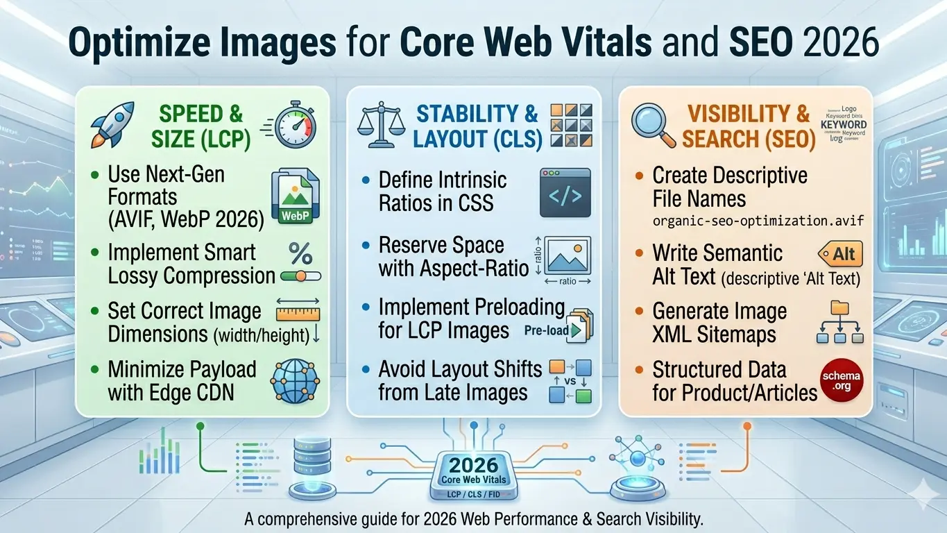
Google's Core Web Vitals are now a confirmed ranking factor. If your website loads slowly, you're losing traffic, rankings, and revenue. The #1 culprit? Unoptimized images that account for 50-90% of total page weight. In this guide, I'll show you exactly how to fix this using free tools and proven techniques.
What Are Core Web Vitals?
Core Web Vitals are three metrics Google uses to measure user experience:
| Metric | What It Measures | Good Score | Image Impact |
|---|---|---|---|
| LCP (Largest Contentful Paint) |
How fast the largest element loads | Under 2.5s | ⚠️ HIGH — Hero images, banners |
| FID (First Input Delay) |
How fast the page responds to clicks | Under 100ms | ⚠️ MEDIUM — JavaScript from lazy loading |
| CLS (Cumulative Layout Shift) |
Visual stability during loading | Under 0.1 | ⚠️ HIGH — Images without dimensions |
Key insight: Two of the three Core Web Vitals are directly affected by how you handle images. Fix your images, fix your rankings.
Why Images Kill Your Website Speed
Here's what I see on most websites:
- 📸 4MB JPEGs uploaded straight from a DSLR camera
- 🖼️ PNG screenshots that should be JPEG or WEBP
- 📱 No responsive images — desktop-sized images loading on mobile
- 🐌 No lazy loading — every image loads immediately, even below the fold
- 🎨 Wrong format choices — using PNG for photographs, JPEG for graphics
I've seen e-commerce sites where product images alone added 15MB to the homepage. That's a guaranteed failing Core Web Vitals score.
Step 1: Choose the Right Image Format
This is the foundation of image optimization. Using the wrong format can increase file sizes by 500% or more.
Format Selection Guide:
| Image Type | Best Format | Why | File Size |
|---|---|---|---|
| Photographs | WEBP | 25-35% smaller than JPEG | Smallest |
| Logos & icons | WEBP or SVG | Transparency + small size | Tiny |
| Screenshots | WEBP | Sharp text, small size | Small |
| Complex graphics | PNG | Lossless, transparency | Medium |
| Simple animations | WEBP | Replaces GIF, 60-70% smaller | Small |
| Print-ready files | TIFF | Maximum quality, CMYK | Large |
Pro tip: Use our free WEBP converter to instantly convert your existing images to the most efficient web format.
Step 2: Compress Images Without Losing Quality
Compression is where most file size reduction happens. The goal is visual indistinguishability from the original at the smallest possible size.
Compression Settings by Use Case:
| Use Case | Format | Quality Setting | Expected Reduction |
|---|---|---|---|
| Hero banners | WEBP | 80-85% | 60-70% |
| Product photos | WEBP | 75-80% | 70-75% |
| Thumbnail galleries | WEBP | 60-70% | 75-85% |
| Blog post images | WEBP | 70-75% | 70-80% |
| Background textures | JPEG | 50-60% | 80-90% |
| Icons & UI | SVG or WEBP | Lossless | 50-90% |
Important: Never recompress an already compressed JPEG. Always start from the highest quality source available (RAW, TIFF, or original PNG).
HTML Implementation:
<img srcset="
  image-400.webp 400w,
  image-800.webp 800w,
  image-1200.webp 1200w"
  sizes="(max-width: 600px) 400px,
         (max-width: 1000px) 800px,
         1200px"
  src="image-1200.webp"
  alt="Description"
  width="1200"
  height="800"
  loading="lazy">
Key attributes:
srcset— Multiple image sizes for different screen widthssizes— Tells browser which size to use at which viewportwidth&height— Critical for CLS; prevents layout shiftloading="lazy"— Defers offscreen images, improves LCP
Step 4: Fix Cumulative Layout Shift (CLS)
CLS happens when images load without reserved space, causing content to jump around. This is annoying for users and penalized by Google.
Always Specify Dimensions:
<!-- BAD: Causes layout shift -->
<img src=<"photo.webp" alt=<"Product">

<!-- GOOD: Reserves space before load -->
<img src=<"photo.webp" alt=<"Product" width=<"800" height=<"600">
Modern approach with aspect-ratio:
.image-container {
  aspect-ratio: 16 / 9;
}
Step 5: Enable Lazy Loading
Lazy loading defers offscreen images until the user scrolls near them. This dramatically improves initial page load time and LCP.
Native Lazy Loading (No JavaScript Needed):
<!-- Below-the-fold images -->
<img src=<"gallery-1.webp" loading=<"lazy" alt=<"Gallery photo">

<!-- Above-the-fold hero image -->
<img src=<"hero.webp" loading=<"eager" alt=<"Hero banner">
Rule of thumb:
loading="eager"— Hero images, above-the-fold contentloading="lazy"— Gallery images, blog post images, footer content
Step 6: Use a Content Delivery Network (CDN)
A CDN serves your images from servers closest to your visitors, reducing latency and improving load times globally.
Popular Image CDNs:
| CDN | Best For | Key Feature |
|---|---|---|
| Cloudflare Images | All websites | Automatic format optimization |
| Cloudinary | Dynamic images | On-the-fly transformations |
| ImageKit | E-commerce | Real-time resizing |
| AWS CloudFront | Enterprise | Global edge locations |
Step 7: Monitor and Test Your Results
You can't improve what you don't measure. Use these free tools to track your Core Web Vitals:
Essential Testing Tools:
| Tool | What It Tests | URL |
|---|---|---|
| PageSpeed Insights | LCP, FID, CLS + suggestions | developers.google.com/speed/pagespeed/insights |
| GTmetrix | Full performance report | gtmetrix.com |
| WebPageTest | Detailed waterfall analysis | webpagetest.org |
| Chrome DevTools | Real-time debugging | Built into Chrome |
| Google Search Console | Core Web Vitals report | search.google.com/search-console |
Before & After: Real Results
Here's what proper image optimization achieved for a client e-commerce site:
| Metric | Before | After | Improvement |
|---|---|---|---|
| Homepage size | 8.4 MB | 1.9 MB | 🔻 77% smaller |
| LCP score | 4.2s | 1.8s | 🔻 57% faster |
| CLS score | 0.35 | 0.03 | 🔻 91% better |
| Google ranking | Page 3 | Page 1 | 🔺 18 positions |
| Bounce rate | 68% | 42% | 🔻 38% lower |
Quick-Start Checklist
Print this checklist and work through it for every image on your site:
☑️ Format Optimization:
- ☐ Convert all photographs to WEBP (free tool)
- ☐ Convert logos/icons to SVG or WEBP
- ☐ Replace GIF animations with animated WEBP
- ☐ Keep PNG only for images needing lossless editing
☑️ Compression:
- ☐ Set WEBP quality to 75-85% for most images
- ☐ Compress thumbnails to 60-70%
- ☐ Never recompress already compressed JPEGs
☑️ Technical Implementation:
- ☐ Add
widthandheightto every<img>tag - ☐ Implement
srcsetfor responsive images - ☐ Add
loading="lazy"to below-the-fold images - ☐ Use
<picture>element with JPEG/PNG fallback
☑️ Testing:
- ☐ Run PageSpeed Insights on every page
- ☐ Check Google Search Console Core Web Vitals report
- ☐ Test on mobile (throttling to 3G)
- ☐ Verify CLS score is under 0.1
Free Tools to Get Started
Optimize your images today with our free browser-based converters:
| Tool | Best For | Link |
|---|---|---|
| Image to WEBP | Reduce photo sizes by 25-35% | Convert Now |
| Image to PNG | Create transparent backgrounds | Convert Now |
| Image to JPEG | Universal compatibility | Convert Now |
| Image to SVG | Scalable logos and icons | Convert Now |
All tools are:
- ✅ 100% Free — No credit card, no signup
- ✅ Privacy First — Your images never leave your device
- ✅ Instant — Convert in seconds, download immediately
- ✅ Browser-Based — Works on any device, no software install
Conclusion
Image optimization isn't optional anymore — it's a ranking requirement. By following the steps in this guide, you can:
- Reduce page sizes by 60-80%
- Improve LCP scores to under 2.5 seconds
- Eliminate layout shifts for CLS under 0.1
- Climb Google rankings with better user experience
- Increase conversions with faster-loading pages
Start with format conversion (JPEG → WEBP), then implement responsive images, lazy loading, and dimension attributes. Test with PageSpeed Insights, iterate, and watch your metrics improve.
Questions? Contact our team or explore all free image converters.